KEEBLER BRAND RENOVATION
Modernizing
the Magic
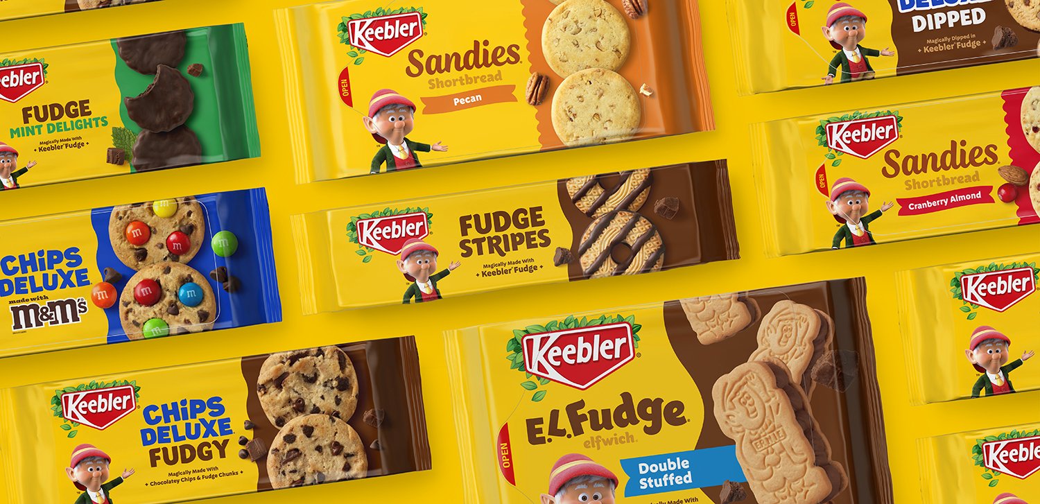
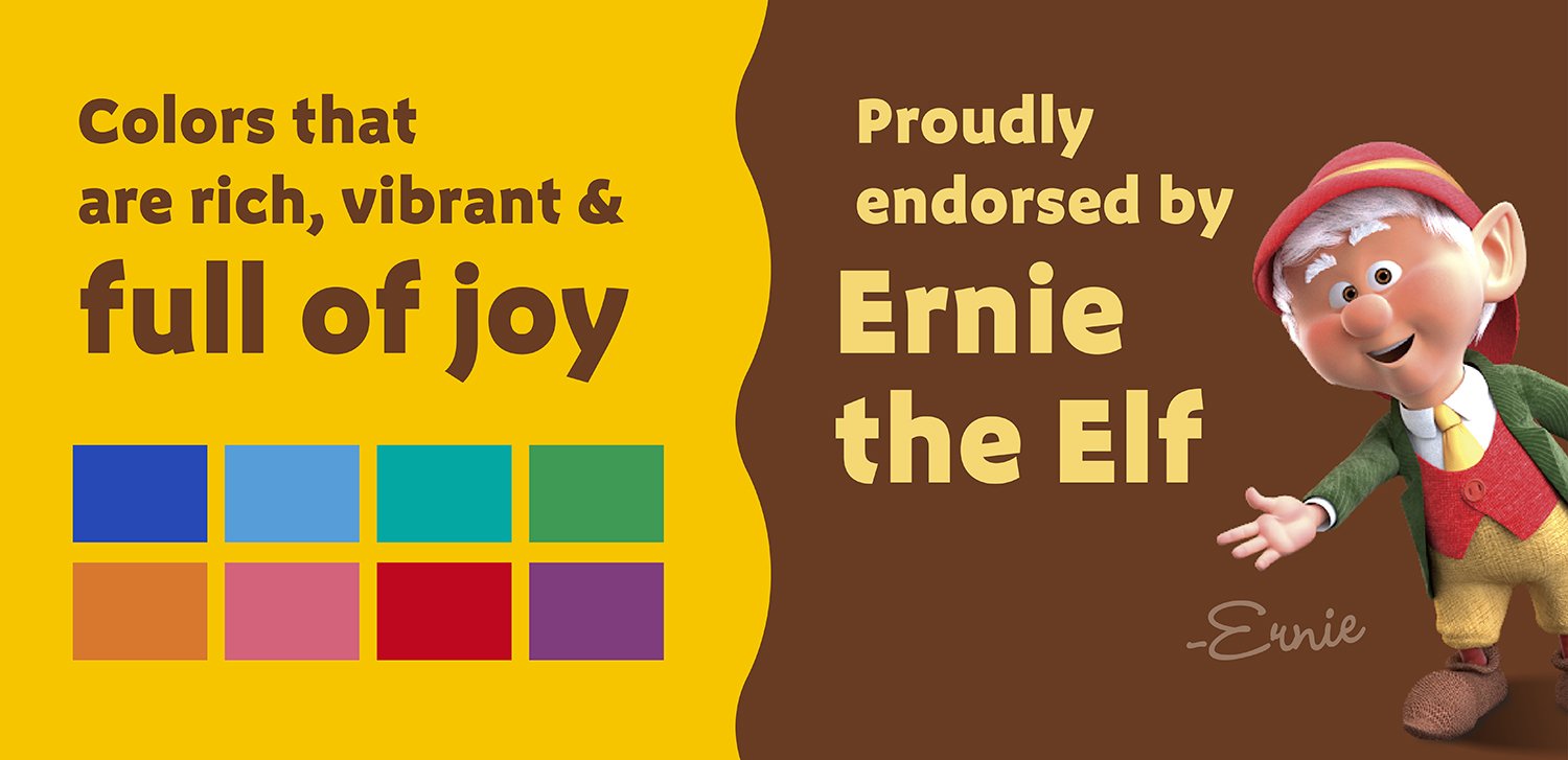
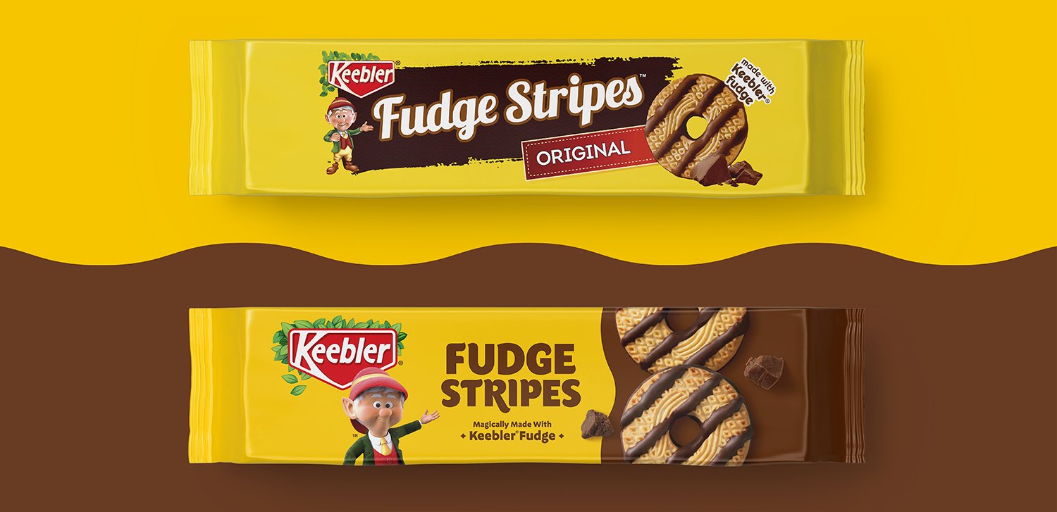
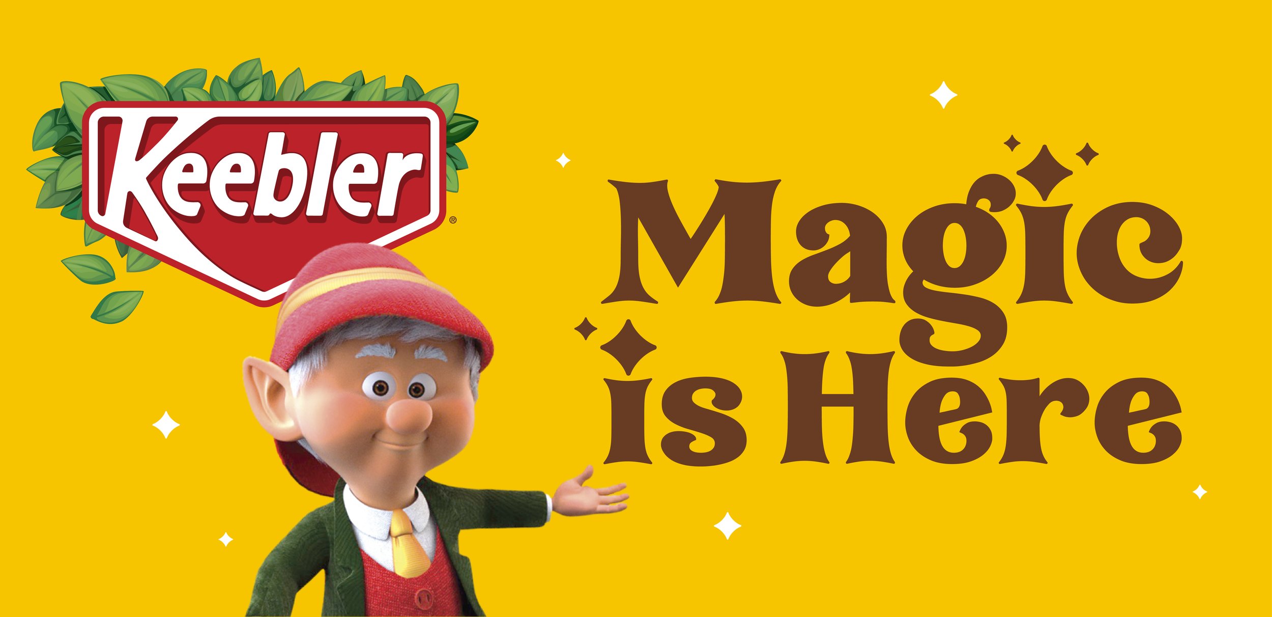
Ernie the Elf has been delighting kids, parents, and grandparents alike with his delicious cookies and signature fudge for generations. When Ernie wasn’t baking cookies in his magical treehouse, he was keeping the family of brands together at retail shelves. But even with a familiar brand character and powerful equity color, the portfolio of products lacked cohesion. Keebler was craving a portfolio redesign that would maximize the impact of its distinctive assets while uniting the portfolio, and enhancing shopability.
Our packaging redesign balanced fixed and flexed assets to create a unified packaging design system that effortlessly extends to various sub-brands. By simplifying the design architecture, we were able to amplify appetite appeal with prominent product photography. The product shots were further highlighted by a color-coded band that billboards from pack to pack creating a more powerful brand impression on shelf. These simple yet significant shifts upheld the magic of Keebler while baking in more impact for today’s modern consumer.

Brand Identity, Visual Identity, Copywriting , Packaging, Photography, Brand Standards
Services