RITZ BRAND RENOVATION
Becoming An Icon Of Social Snacking
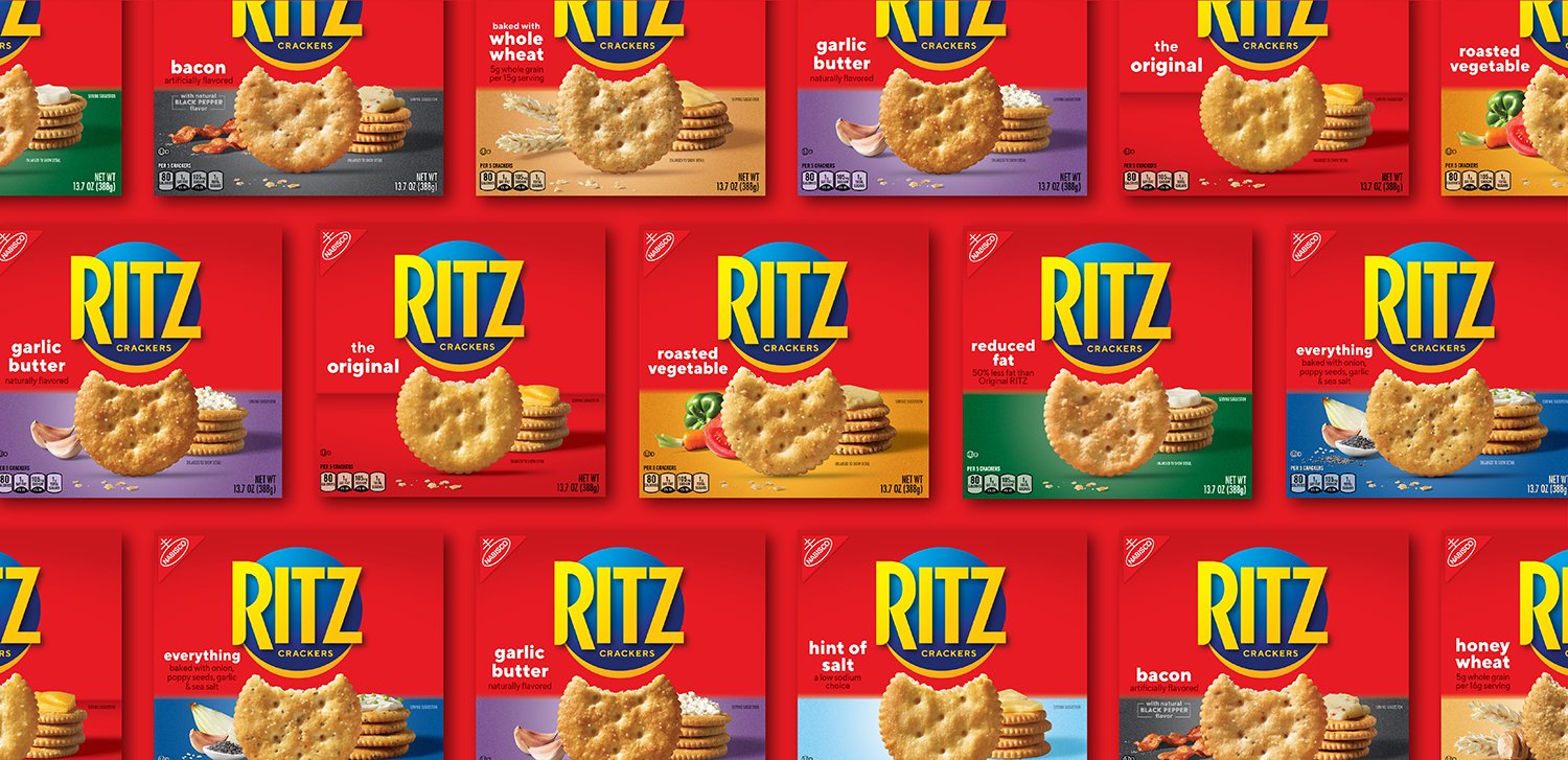
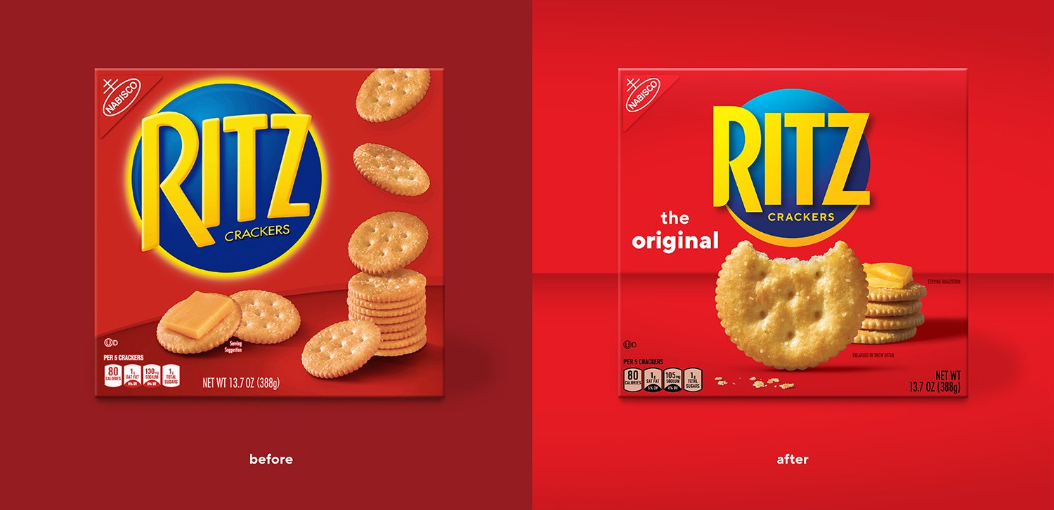
Introduced by Nabisco in 1934, Ritz offered “a bite of the good life” for those living during the Great Depression. By 2019, Ritz had become the go-to cracker for “good life” occasions such as family parties and holiday celebrations but was lacking relevancy in the more frequent and informal snacking occasions. With an iconic cracker shape, prominent branding, and striking equity color, a lot was working for the brand, yet it needed a purposeful evolution that could take the cracker from an entertaining hors d’oeuvre to the icon of social snacking.
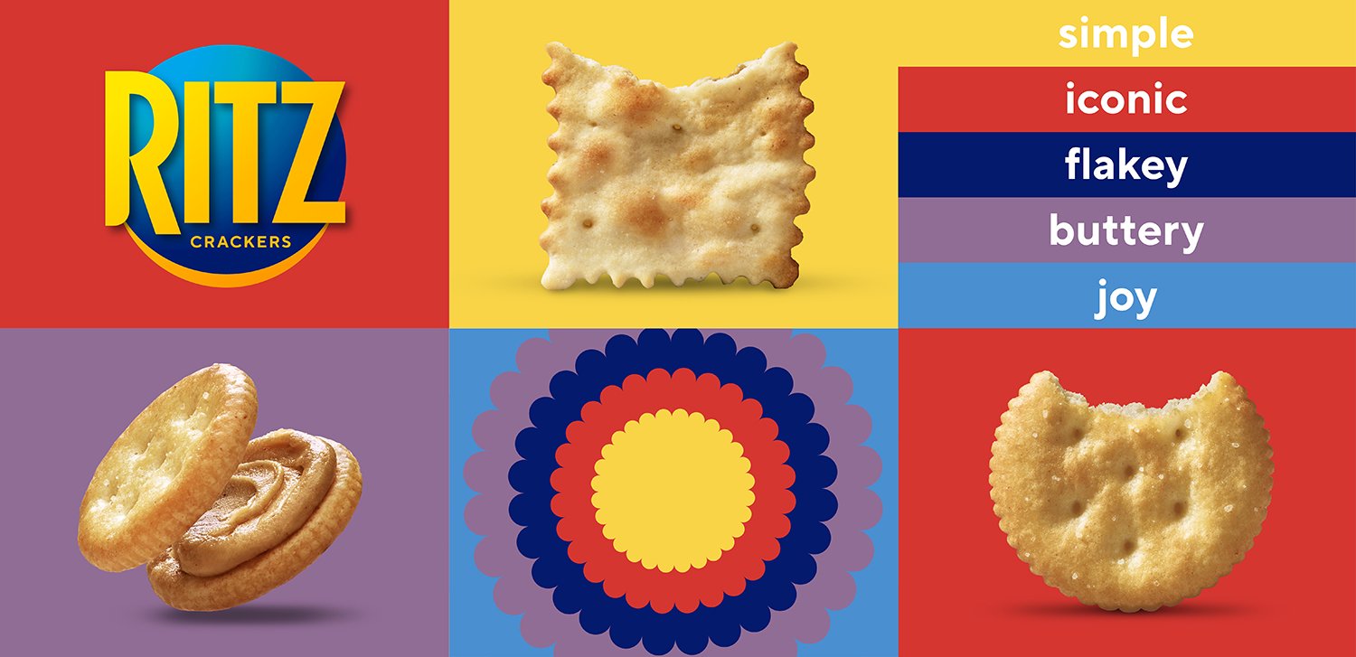
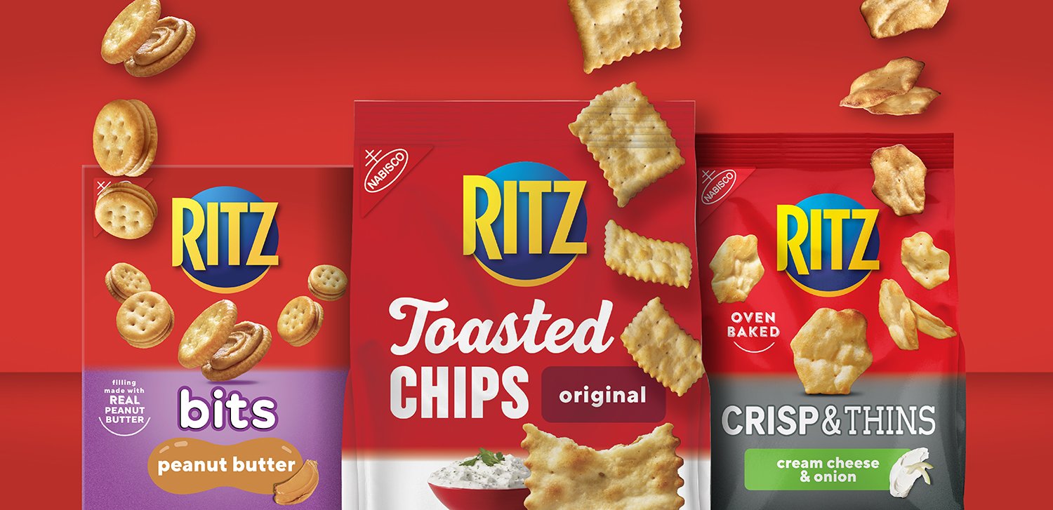
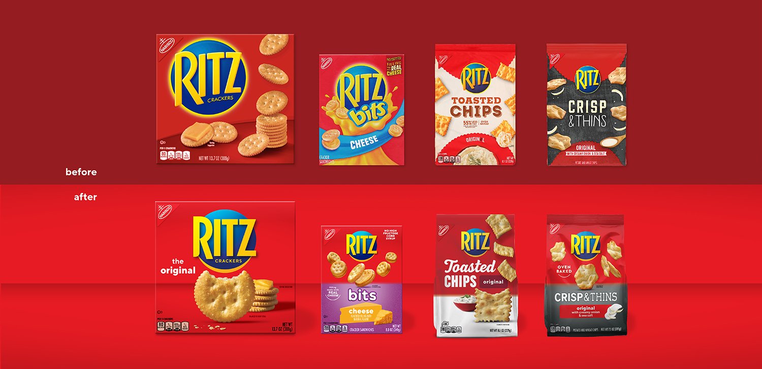
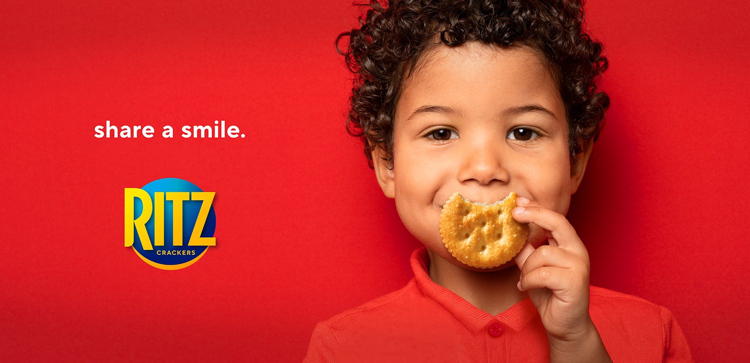
Bringing a bite of joy to the brand, we optimized the brand identity to include a subtle smile. This was complemented by macro product photography that showcased a partially eaten cracker, leaving another smile to be discovered. The optimized packaging design system improved portfolio cohesion while offering enough flexibility to communicate the unique RTBs of the four sub-brands and over 70 SKUs.
Brand Identity, Visual Identity, Packaging, Photography, Copywriting, Brand Standards
Services